AbleTrend Projects Market Directions on Charts by Colors
AbleTrend Actually Projects
Market Directions on Chart with Colors
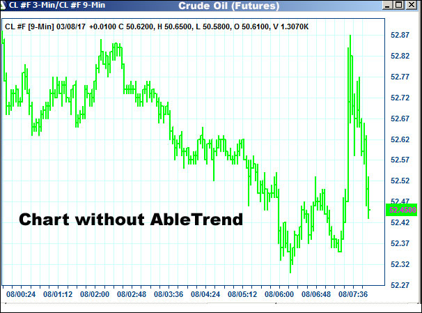
With most trading software interpreting the charts – and what to do – is up to you, the trader. Your chart shows you the complete price history but you have to decide whether the price movement is forming a particular pattern you trade on.
Take a look at the chart below, for example. What price pattern do you see?
Unfortunately, interpreting chart formation is as much art as science. Ultimately, success in trading depends – to a large degree – on the trader’s subjective interpretation of whether a pattern or signal is forming on the charts. Whenever decision-making is subjective, you risk having your emotions getting in the way of making the correct move. That’s the defect in your trading that AbleTrend 7.0 can help you solve….
AbleTrend charts are color-coded to show the hidden resistance and support levels – and specific buy and sell signals – that tell you exactly what to do … and when.
It’s 3 steps:
- Buy on BLUE
- Sell on RED
- Exit when price penetrates the support or resistance
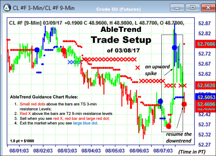
Just take a look at this chart below … and compare it with the one above. Which looks more useful to you – or easier to interpret?
Look at the above Setup chart, read the rules showing on the chart, what would you do? Buy, sell or hold?
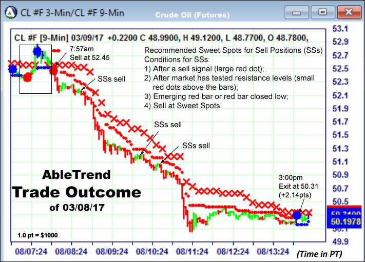
Now look at the Outcome chart below:
This is yesterday’s Crude Oil (CL) chart with Brightly color-coded buy and sell signals – displayed on every AbleTrend 7.0 price chart — help you:
- Make more objective – and accurate – trading decisions.
- Precisely time entry and exit points.
- Trade with greater confidence — less uncertainty and anxiety.
- Cut your losers early – to minimize losses on trades that don’t go your way.
- Ride your winners longer – for greater trading profits.
- Exit when it’s the right time to take profits – and not let greed make you irrational.
With Warm Regards
Grace Wang
AbleSys Corp.
Gracezh@ablesys.com
Comments are closed.


